Tuesday, June 8, 2010
Project 3: Studio Attempt 2
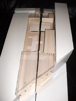
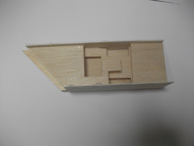
The following images show my design thinned to match the brief requirements addressing the issues of the angle of sun and brief requirements that our fill in tutor had noted.
Saturday, May 29, 2010
Project 3: A Little Inspiration
My main idea of theatricality and its ability to emphathise with the viewers (and in the art gallery's case; the artwork) was drawn through the study of Garnier's Paris Opera House in History. It use of internal balconys relating the levels to the interior stair hall allow this idea of see and be seen. Further the many foyers that are passed through prepare the person for the sublimity of the interior space unrealting it to the interior. Theatricality is also considered externally in Barnet's Lands Department buildings, where the external loggias relate to the people on the street, in the sqaure and to the builing itself. It also demonstrates how these balconies offer a relief to the occupant away from the interior.
Another gallery I find uses opens spaces and balconies to create theatricality is the Restored Building for Zabludowics Art Trust in London. This space uses a rhythm from the intimate, open and intimate spaces that relate to the balconies above. The upper balconies provide seating for those to rest and to simply see and be seen by others in the gallery. It also allows the artwork to be viewed from different angles.
I like the roof used on the Herbert Art Gallery and Museum in Coventry. It's roof uses a geometrical way of allowing and disallowing direct sunlight to filter into the building. This could be useful in my design on the top level by allowing light into certain areas and not into others, allowing me to control the diffused and direct light.
Finally I like the Whitechapel Galery in London and how its facade relates to the surrounding buildings. The horizontal lines and the height of the building relate to the surrounding ones however its entrance is set back into the facade making the building stand out. It used of material also does not directly relate to the surrounding buildings. These aspects allow the gallery to 'fit in' with the urban fabric but still allow it to stand out as an important building.
Monday, May 24, 2010
Project 3: Studio Attempt
For my design I've decided to set it back from the street a little to create a congregation space. I have also introduced a cafe (to be commercially rented out by the owner) that limits the entrance space to the gallery itself, provides a space for people to rest before, after or during their visit to the gallery and to immediately introduce the idea of theatricality into the building and the art works focus on everyday human life. The entrance to the gallery is significantly smaller then the main room to emphasise how big it is and the sublimity of the room and the art. This main room when on the bottom floor allows you to look all the way up to the sky, noticing the other level mezzanines and the other people in the gallery. There are also thinner tall rooms either side of the stairs which I hope to use exterior surfaces such as grass in the lowered flooring and exposed brick on the wall to create a relationship with the outside that is also seen through the sky above. The last gallery space on the lower level is cover and more intimitate, seperated from the other spaces by columns. The stairs then also create a sense of theatricality and being able to see and be seen as you move between levels.
The second level is mainly mezzanine spaces to view artworks and the people below you. The covered gallery at the back also doubles as the main place for functions due to the lounge and kitchen behind it. At the front of the building there is a public workshop, for artists to painting viewing and being viewed by the public and also a space for public art workshops to take place. There is also a balcony this level that draws a relationship between the building, the people inside and the people outside establishing theatricality and giving the people a momentary escape into the sublimity of the world outside. There is also a very small intimate gallery space on this level. This second floor balcony also reaches out to align with the cover for the path along king street.
Finally the third level had a slanted roof to match the heights of the surrounding buildings. It has a small mezzanine space again allowing theatricality and leads to the exterior sculpture garden. This sculpture garden is bounded by the front facade, the walls of the gallery and by the lower building. This means it is open to not only the sky but also to look out across the other buildings at out into the city. This level involves two other exterior gardens; one private for the gallery own next to his apartment, and the other for a private workshop space for visiting artists or community art groups.
Project 3: Site
I have chosen to use site 3 for this project as it can produce for me a linear and vertical movement through the galleries. I also find that its diagonal and large frontage nature leave me able to play with how the building is set at the front and allow me to design a commercial space for rent. I also like the difference in the buildings that surround it, both in height in design.


Project 3: Narrative
The owner of the gallery gives the following brief:
- the gallery needs to be a place to view various works of art reflecting everyday human life to teach the public to reflect on their own situations and see the positives in their everyday life
- it needs to fit in with the surrounding buildings and the urban context but still needs to stand out and attract people
- the artist workshop needs to be open to be view by consumers and public
- theatricality shall be included within the design for the public to see and be seen so they feel apart of the artwork and observe the everyday life around them
- skylights shall be the main soure of natural light
- need a space for the public to rest and appreciate
- open to public for art classes making it a community space
Some ideas for arrangement of rooms:
Subscribe to:
Comments (Atom)


